RE/ACT
Everyday inspiration comes from all around us, especially when it comes to fashion. No one ever wants to be labeled as boring. So RE/ACT challenges other magazines by providing a fresh take on topics such as fashion, beauty, politics, tech, and culture,
About the project.
The rise of the digital press has seen a tremendous peak over the last years. The audience is increasing as Millennials grow older, demanding all sorts of content. The best magazines and newspapers had already launched their digital version in early 2000, but it has been only in the last 5 years that the digital experience started to take its own shape. With numbers increasing, publishers are prompted to deliver quality content along with a great digital product for readers to experience a different but still unique act of opening up a magazine and diving into it.
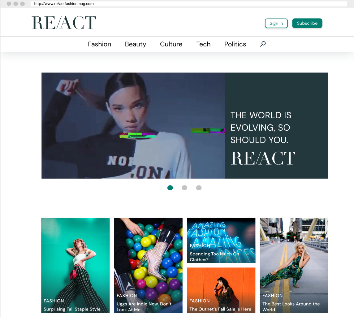
For this project, I created a responsive online platform for a magazine directed to meet the needs and goals of my user persona Candice and other millennials like her. RE/ACT was created for an editorial design project focused more heavily on UI. Although it was UI focused a lot of UX research was still involved as we wanted to fully understand the user’s needs in order to create a fresh, distinctive, and effective fashion magazine. I focused more on everyday fashion rather than runway fashion to make the magazine seem more relatable, the color palette used vibrant and bold colors to make it more playful, and the images were large and clear so that readers got more of a visual image rather than text as they later indicated it was what they wanted to see in a fashion magazine.
User Persona
For starters let’s meet Candice. Candice is a trendy marketer, she is 27 years old and single. She is from Conneticut but recently moved to Brooklyn, New York. Furthermore, she reads fashion magazines as inspiration for work whenever she has a free moment, which is usually during her long journeys during work trips on the train. Her goal is to stay current/know the latest trends, dress/appear fashionable, and become more tech-savvy. Candice currently reads Vogue, People, Cosmopolitan, and Elle. Candice likes these magazines but they all seem the same to her and lack youthfulness at times or feel overwhelming. Moreover, many have so many topics its hard to look through them, it also bothers her when the magazines mention more about celebrity lifestyles than the fashion itself as it is something she feels passionate about. Candice wants a magazine that has few topics with a lot of relevant content, inspiration for work, and is more visually appealing.
Surveys and User Interviews
Since we can’t rely on just one user persona, I decided to send out a survey and conduct 5 user interviews in order to dig deeper into the user’s needs and pain points when it comes to their digital content consumption. The survey that was sent out garnered 50 responses and with our 5 user interviews, the feedback was very insightful. 66.7% indicated that they didn’t enjoy the online publications because they don’t have time to read them when most aren’t “short and digestible.” 70% said they were more likely to read an online fashion magazine based on appealing design layout, fun colors, and clear/large images. When it came to the content that they actually want to see in a magazine 84% said fashion, beauty, news, and tech as their top choices. For interviews, the overall feeling was that users found magazines to be overwhelming, a bit stereotypical when it comes to women’s images for everyday readers, and oversaturated with ads. After reviewing all this the question left to answer was: How might we provide users with a relevant trendy fashion, current events, and inspiration without making them feel overwhelmed?
Benchmarking
With the how might we on hand the objective was clear, to create a relevant trendy fashion magazine that featured current event articles and give inspiration without feeling overwhelming to readers. The main competitors that I focused on were Elle, Vogue, People, Cosmo, and Bazaar. I found that these publications crammed lots of information and 10+ different categories onto their pages. To look for inspiration for the layout I did find the layout for Vogue to be pleasing so I took some inspiration from that as well as inspiration from other magazines like Rolling Stones and i-D.
Brand Positioning
Through the brand positioning tool, I knew exactly where my brand would fall into. RE/ACT would be a niche target - tech-savvy women looking for inspiration through everyday fashion. More importantly, all the other magazines such as Vogue, Elle, and Harper’s Bazaar have a paid subscription fee for those who want to view all their content and have a high variety of categories while People. Cosmo and Teen Vogue have a ton of celebrity gossip articles, ads, and/or high subscription prices and aren’t as serious as the previously mentioned magazines. RE/ACT would be different since it would target women looking for specific topics, inspiration, and enjoy reading informative fashion articles without having to flip through celebrity gossip, ads, or having to pay a high subscription. This was an essential part of the process since it illustrated and tailored the thinking into my main clientele.
Lo-Fidelity
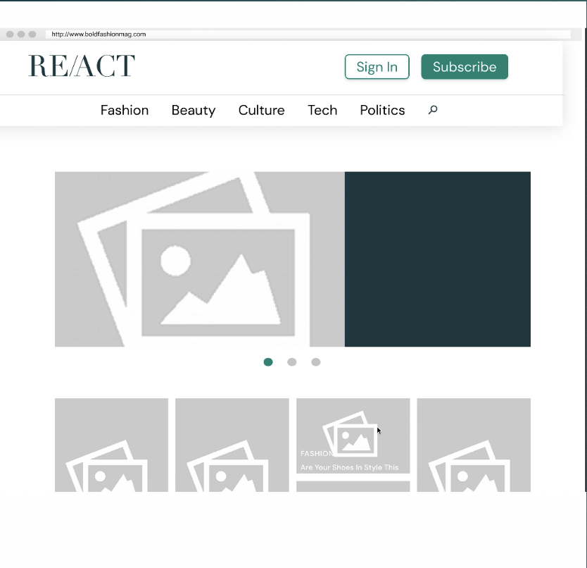
After researching it was time to draw up the lo-fi and test it. Firstly, the original name for my brand was going to be BOLD but in the end, I did not feel this would go well with the overall design I envisioned it changed to RE/ACT. I tested and 5 users and overall they all understood how to navigate the app. The feedback I received was more on the hamburger menu and how to simplify it to make it take the whole screen instead of simply popping out. I also had users say they wanted a search bar, ad an (x) button to the menu. Users also suggested adding more videos/gifs. With this in mind, necessary changes were made and I moved on to mid-fi.
Mid-Fidelity
During this stage of the design, I tested this on 6 users to get additional feedback. I knew the main color was emerald green and the images would have vibrant pops of cool colors and feel fun. I made a note to add white space so I would let the images breathe. I added a sign in and subscribed button on the top right. I also added a carousel for the highlighted stories so people would have a shortcut to them. Another minor change made was aligning the footer and making it smaller so that it didn’t take too much space. Other than that users did not have any additional feedback and felt like they could navigate the website without any issues.
Mood board
I made a mood board so that I could organize what I wanted for the fonts, colors, images, illustrations, and layouts. I wanted the colors to be bright so that the reader felt relaxed and happy when looking at the magazine. The idea of images being next to each other in different sizes made it appealing like a small collage of inspiration. I wanted to minimize any excess of text and primarily focus on the vibrancy of the images used this would take away any overwhelming feeling for the user.
Style Tile
I wanted to keep the website clean and simple with a lot of white space for images and text to breathe. The idea was to have the website be minimal with a punch of color. I wanted the images and fun colors to shine through and speak for themselves. Originally I had more primary colors but it felt exaggerated and noisy. The emerald green provides a fun twist of sophistication.
High-Fidelity
I experimented with different layouts in high-fi since many indicated in the interviews that they wanted a small element of spontaneity. Other than that no major changes were made when finalizing the high-fi. Below is the mobile version of the magazines’ website.


