VAIRKKO Marketing Website
Redesigning a website.
How Might We?
better our marketing website to feature all the tools the VAIRKKO platform has to offer so that clients make an informed decision and better manage their employees, maintain training standards, track multiple certifications, etc. - all from a one HR & LMS platform without needing an additional system?
About the Project
10 years after VAIRKKO’s marketing website launched, it was time for an overdue redesign. The marketing website was my first project as the founding UX/UI Designer at VAIRKKO and was designed using the new process from start to finish. This redesign provided a better way of informing potential new clients of everything VAIRKKO had to offer.
Research shows that approximately 90% of potential leads’ decisions come from first impression of the website. We knew the marketing success would rely heavily on the improved UX/UI.
The process I implemented allowed for a clear direction in how we would go about redesigning this website to ensure we could begin implementation by the required date without needing to go back and make changes.
Surveys
First up was surveying users who had sent their information to participate in a demo to learn more about VAIRKKO. The purpose of this user survey was to gather insight on what new potential clients wanted to see on the website so they could better decide if the VAIRKKO platform could be a good fit for their company needs. We needed to get a better understanding from users about their company needs, why they were interested in switching platforms, and which HR & LMS functionalities would help propel their company forward. We found that we weren’t showing enough visuals and needed more descriptions for the tools within each given feature as users indicated this was important for their decision making when booking a demo.
Lo-Fidelity
In my UI design process I started with Lo-fidelity to sketch out all my ideas and layout the potential new look of the marketing website. I demonstrated my sketches to my team to get internal feedback. The goal was to make this new iteration of the website more insightful on what our product could do for their employees and how it could better their current work system. We wanted to make sure we added enough value to the website to get users to book a demo with VAIRKKO. Once all the feedback for the sketches was collected I moved on to mid-fidelity!
Mid-Fidelity
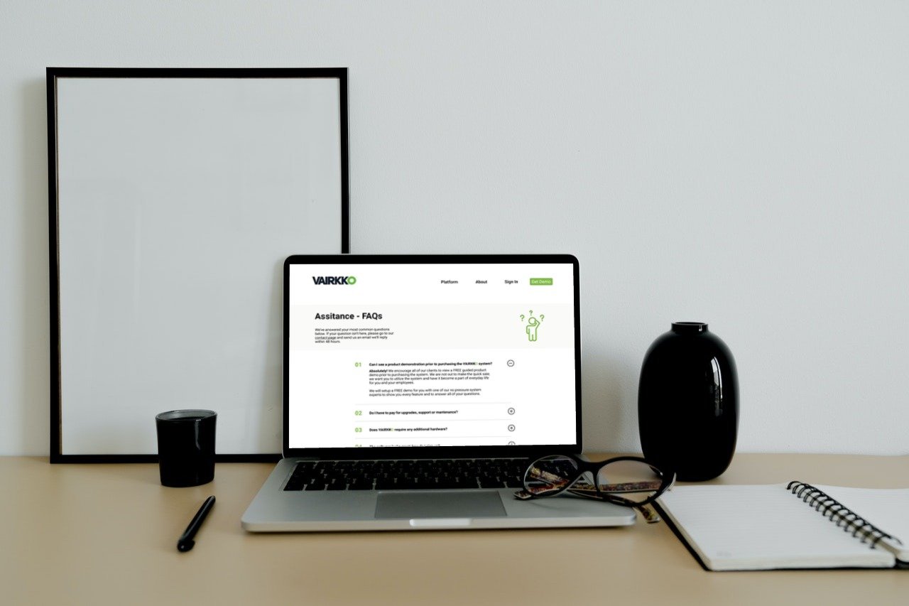
Once all feedback was gathered iterations were made during the mid-fidelity to add visuals and content as well as focus somewhat primarily on the UI. We needed to ensure that all the images and videos acted as a guide for the users to read more and gather as much information as possible before moving on to the next page. We also added pages that both internal team members and users felt were missing like our blog page to see we were well informed on industries practices. We also for example, we added an FAQ page as that did not exist in the current website and users felt like that was an important page as they did not always want to wait on an email to have a simple question answered.
Mood Board
Iterations
The menu was condensed to simplify it and get rid of existing confusion among users asked users what they thought about the new menu option as shown on the right. There was some confusion here since originally we just listed off all options rather than breaking it down into section. We received feedback that the UI menu felt overwhelming and “busy”. In addition to this feedback, I also gathered internal feedback and made the iteration to make the menu into two sections which were “HR Products” and “LMS Products” to better differentiate the two parts the VAIRKKO platform offered. Once all the iterations for the website was made it was ready for the web developers and is now currently being developed to come out this summer.
First Click Test
This was the first ever redesign done with UX VAIRKKO had done we conducted many first click tasks to know where users would intuitively think to look for information. For example we asked users where they would click to look for our “Contact Us” page in case they has questions but weren’t ready to commit to an hour long demo. Users had an easy time understanding where they would find things proving that our placements were indeed easy to find for them. For anything that seemed difficult for them to fine we made sure to improve. Feedback was extremely helpful as we did not need to rely on assumptions or gut feelings but rather on user research and testing.
Hi-Fidelity
I used my style guide to create a hi-fi prototype and continued with testing. Here you can see the new main screen for the website while below is the original. I added information such as examples of companies who use us, testimonies of our satisfied users, and additional information. All this was done thanks to user feedback which informed us what they wanted to see before setting up a demo or even considering the platform. Our first impression for potential clients needed to improve and it did. The call to action is now bright and present at the top for a more intuitive experience, and I created more breathing room between sections so that the users eyes can focus on one section at a time without feeling overwhelmed.
Final Prototype
Note: the GIFs represent on each page represent videos of that specific feature. This redesigned website will come out late this summer 2022.


